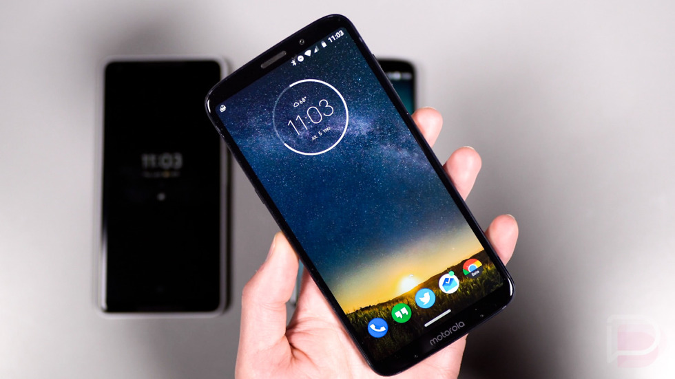
Android Gesture Battle: Google vs. OnePlus vs. Motorola
Gesture navigation sure appears to be the future of Android navigation. With Google building it into Android P, it will only be a matter of time before we see the majority of Android companies follow in their footsteps.
Two companies that are already doing it are OnePlus and Motorola. The OnePlus 5T and OnePlus 6 both support a version of gesture navigation, as does the the Moto Z3 Play, thanks to a software setting that is similar to Google’s in Android P. After spending the past couple of weeks with the Moto Z3 Play and enabling Motorola’s gesture navigation, I felt like it was something you all needed to see.
So in this video, I take a look at how Android P’s gesture navigation compares to OnePlus’ and Motorola’s. All three are very different and I think that Motorola might have the best setup yet.
While there are certainly bits and pieces from Google’s that I appreciate, the extra swipes needed to get into the app drawer, plus the presence of a back button, gives Motorola the edge. As for OnePlus, their navigation is fine, it just lacks any sort of on-screen button to give it that sense of stability or access to Google Assistant. With nothing to let you know that there are gestures available, my mind constantly wonders if I can rely on it, whether that’s fair or not. It’s a mind trick, in a way, and one that I’ve just not gotten used to.
For Motorola, they are keeping it simple. Their navigation button acts as a home button that lets you enter the app switcher with a swipe to the right or go back with a swipe to the left. You can also still get into Google Assistant and the app drawer as you’ve always been able to.


Post a Comment